Today theme is modern and minimalist bedrooms. This look usually has a mixture of simple furniture and those out-of-this-world artistically designed pieces. In modern bedrooms, the bed is usually the one that stands out. The modern style usually makes of platform beds. This kind of bed is the newest rage in bedroom design. The minimalist approach to bedroom interior design is all about clearing the clutter and reducing the elements of bedroom down to the bare essentials whilst at the same time retaining an aesthetically pleasing appearance in a room.
Monday, April 30, 2012
Friday, April 27, 2012
3-Step Makeover: Small Living Room
Stage 1: Getting StartedWith spartan white walls, bare windows, and mismatched furnishings, this small living room lacks personality and coziness. Pushing the furniture against one wall -- opposite the entertainment center -- is a no-brainer floor plan, but it leaves a runway down the middle, blocks the tall windows, and squeezes access to the adjacent stairs.
Stage 2: Color and a Floor PlanBegin the living room's transformation with lush green paint, plucking the hues from a fabric you want to add later. Light celery washes the walls and ceiling; a darker shade in a durable lacquer-like gloss makes the simple woodwork pop. The door is no longer in use, so we pulled the seating to the room's center, using a sisal rug to define the area. The new arrangement guides you through the room, making it feel more spacious than its 200 square feet.
Stage 2 Room Elements
Existing Furniture: Dress up the slipcovered sofa and chairs with two-sided fabric pillows and new upholstery.
New Furniture: Multitaskers that fill in the holes and adapt for entertaining are key -- the elegant black tray table folds away when there's a crowd, and the space-saving green demilune table doubles as a mini bar.
Windows: Wood blinds with wide fabric tape give windows a finished look.
Artwork: Banish blank walls with a simple grid of framed vintage prints from old books. Green mats coordinate with the trim color.
Lighting: A pair of celadon lamps draws the eye to the room's focal point, the sofa.
Thursday, April 26, 2012
Bedroom Design Ideas
The bedroom is one of those places that takes time to decorate. You can always improve it because you always get bedroom ideas. This time it’s Hulsta to get our inspiration from. The spacious rooms all put a great accent on oak and alder furnishings plus some white and brown lacquered glass, and look amazingly perfect. Clean shapes, amazing eye-friendly colors and designed for those who need their room to be either beautiful and able to store all their stuff. Would you put something like this in your bedroom? Which one do you like the most?
Tuesday, April 24, 2012
Living Room Furniture
Do you want some inspiration for your Living Room Furniture ? If the answer to this question is yes you are in the right place. Today I’ve decided to continue the Living Room Inspiration series, and I’ve gathered six living rooms, from where you can get some inspiration especially if you can’t decide what type of furniture you should purchase for your living room.
If you want more, come back on this blog, because I’ll find more interesting stuff for you.
Wednesday, April 18, 2012
Country Style Kitchens
These English country style kitchen sets from County Kitchen predominantly reflect a traditional style but not without a modern twist on tradition.
Monday, April 16, 2012
Bedroom Inspiration #3
After you’ve saw Bedroom Inspiration #1, and #2 today here I come with the 3rd part of this series, that will continue over time .Enjoy these pictures, and I hope you’ll leave from here a little more inspired. Don’t forget to come back because Bedroom Design Inspiration series is just at episode #3, and there are more to come.
Sunday, April 15, 2012
Dining Rooms From The Orient
Today, we bring you dining rooms from a popular interior design group in Taiwan - Yang Ming Design Group. The style is tilted towards the modern, yet the Asian charm in them is unmissable.
Saturday, April 14, 2012
GALLERY KITCHEN BUDGET IDEAS
Open shelves and a playful color scheme give this small kitchen an airy feel. Black and white vinyl flooring tiles complement the retro look of the vintage refrigerator, which was purchased at a flea market. Laminate countertops also keep costs low.
Keeping the design simple stretches the space in this small kitchen. Costs were kept low by restoring old pieces. Vintage cabinets salvaged from a local 1930s home add a retro feel to the modern kitchen. The clean vertical lines of budget-friendly beaded board soften the modern space and create an appealing texture.
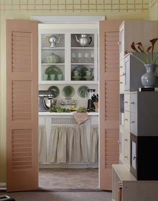
The charming hardwood floors, high ceilings, and abundant storage in this tiny 6x10-foot kitchen provided the perfect base for this facelift. Keeping existing appliances, this kitchen upgrade stayed within the tight budget.
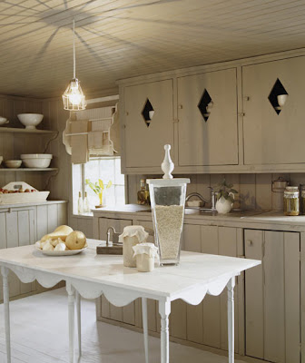
Do-it-yourself skills and paint were primarily responsible for freshening up this homey kitchen. Deemed worthy of preservation, vintage home-crafted cabinets were simply painted with an earthy shade, as were the floor, walls, and ceiling.
White paint and ceramic tile were price-wise choices for prolonging the lives of still-sturdy cabinets, counters, and backsplashes. Like the soft, painted finish on the cabinets and window frames, matte ceramic-tile countertops add a timeless touch.
Cabinets are updated with a coat of paint, new hardware, and opaque glass fronts. Color bursts onto the all-white scene with a green and red mosaic tile backsplash, multi color vinyl floor tiles, and a tomato-red laminate countertop.
Black-painted tiles on the backsplash complement the checkerboard pattern of the vinyl flooring. The warm tone of the painted cabinetry creates an inviting space that is enhanced by the soft look of the sage green walls above.
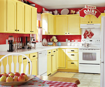
Red crackle paint on the walls and distressed yellow cabinetry add authenticity to a fresh country look. The budget was met by sticking with the builder’s neutral vinyl flooring and splurging on a new white tile counter top.
Subscribe to:
Posts (Atom)